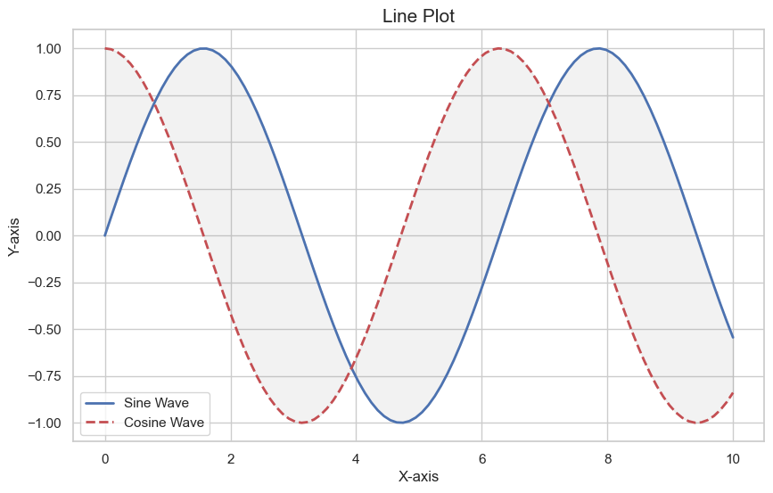
1.折线图
import matplotlib.pyplot as plt
import seaborn as sns
import numpy as np

# 设置风格

sns.set(style="whitegrid")

# 生成数据

x = np.linspace(0, 10, 100)
y1 = np.sin(x)
y2 = np.cos(x)

# 创建图表

plt.figure(figsize=(10, 6))
plt.plot(x, y1, label="Sine Wave", color="b", linewidth=2)
plt.plot(x, y2, label="Cosine Wave", color="r", linestyle="--", linewidth=2)

# 添加装饰

plt.fill_between(x, y1, y2, color="gray", alpha=0.1)
plt.title("Line Plot", fontsize=15)
plt.xlabel("X-axis", fontsize=12)
plt.ylabel("Y-axis", fontsize=12)
plt.legend()
plt.show()
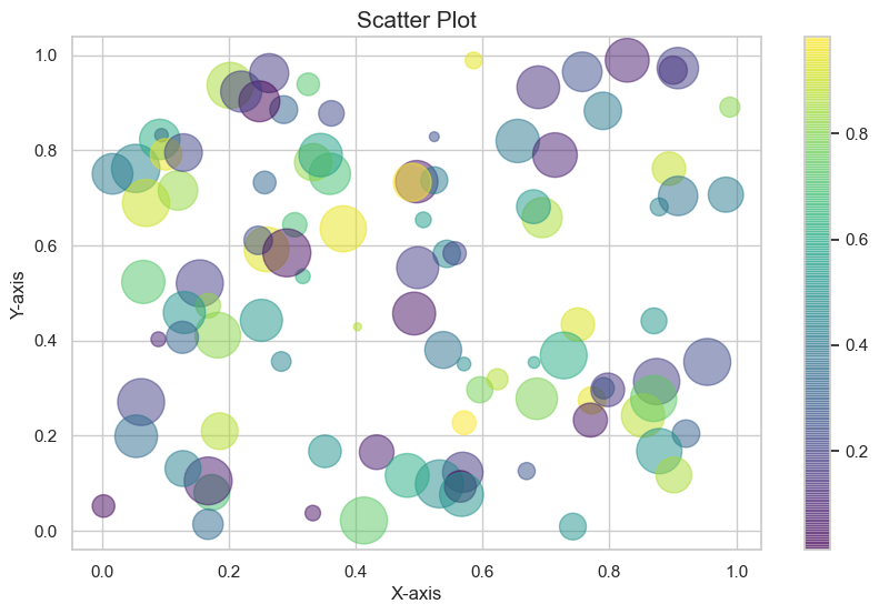
2.散点图
import matplotlib.pyplot as plt
import seaborn as sns
import numpy as np

# 设置风格

sns.set(style="whitegrid")

# 生成数据

x = np.random.rand(100)
y = np.random.rand(100)
colors = np.random.rand(100)
sizes = 1000 * np.random.rand(100)

# 创建图表

plt.figure(figsize=(10, 6))
plt.scatter(x, y, c=colors, s=sizes, alpha=0.5, cmap='viridis')
plt.colorbar()

# 添加装饰

plt.title("Scatter Plot", fontsize=15)
plt.xlabel("X-axis", fontsize=12)
plt.ylabel("Y-axis", fontsize=12)
plt.show()
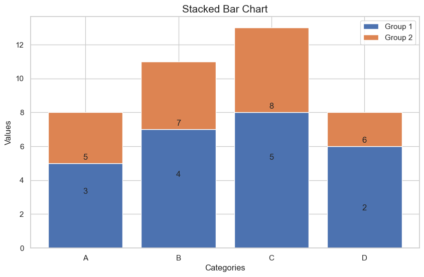
3.条形图
import matplotlib.pyplot as plt
import seaborn as sns

# 设置风格

sns.set(style="whitegrid")

# 生成数据

categories = ['A', 'B', 'C', 'D']
values1 = [5, 7, 8, 6]
values2 = [3, 4, 5, 2]

# 创建图表

fig, ax = plt.subplots(figsize=(10, 6))
bar1 = ax.bar(categories, values1, label='Group 1')
bar2 = ax.bar(categories, values2, bottom=values1, label='Group 2')

# 添加装饰

ax.set_title("Stacked Bar Chart", fontsize=15)
ax.set_xlabel("Categories", fontsize=12)
ax.set_ylabel("Values", fontsize=12)
ax.legend()

# 添加数值标签

for rect in bar1 + bar2:
    height = rect.get_height()
    ax.annotate(f'{height}', xy=(rect.get_x() + rect.get_width() / 2, height),
                xytext=(0, 3), textcoords="offset points", ha='center', va='bottom')

plt.show()
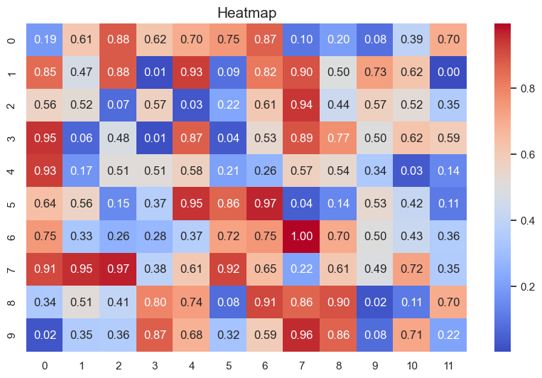
4.热力图
import matplotlib.pyplot as plt
import seaborn as sns
import numpy as np

# 生成数据

data = np.random.rand(10, 12)

# 创建热图

plt.figure(figsize=(10, 6))
sns.heatmap(data, annot=True, fmt=".2f", cmap='coolwarm')

# 添加装饰

plt.title("Heatmap", fontsize=15)
plt.show()
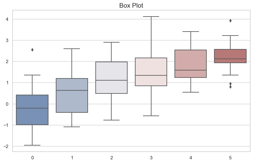
5.箱线图
import matplotlib.pyplot as plt
import seaborn as sns
import numpy as np

# 设置风格

sns.set(style="whitegrid")

# 生成数据

data = np.random.normal(size=(20, 6)) + np.arange(6) / 2

# 创建图表

plt.figure(figsize=(10, 6))
sns.boxplot(data=data, palette="vlag")

# 添加装饰

plt.title("Box Plot", fontsize=15)
plt.show()
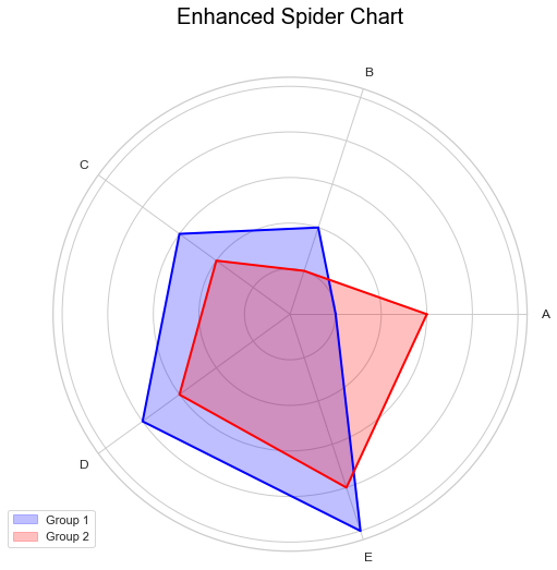
6.蜘蛛图
import numpy as np
import matplotlib.pyplot as plt
import seaborn as sns

# 设置风格

sns.set(style="whitegrid")

# 数据准备

labels = np.array(['A', 'B', 'C', 'D', 'E'])
stats = [10, 20, 30, 40, 50]
stats2 = [30, 10, 20, 30, 40]

# 创建蜘蛛图

angles = np.linspace(0, 2 * np.pi, len(labels), endpoint=False).tolist()
stats = np.concatenate((stats, [stats[0]]))
stats2 = np.concatenate((stats2, [stats2[0]]))
angles += angles[:1]

fig, ax = plt.subplots(figsize=(8, 8), subplot_kw=dict(polar=True))
ax.fill(angles, stats, color='blue', alpha=0.25, label='Group 1')
ax.plot(angles, stats, color='blue', linewidth=2)
ax.fill(angles, stats2, color='red', alpha=0.25, label='Group 2')
ax.plot(angles, stats2, color='red', linewidth=2)
ax.set_yticklabels([])
ax.set_xticks(angles[:-1])
ax.set_xticklabels(labels, fontsize=12)
ax.grid(True)

# 添加标题和图例

plt.title('Enhanced Spider Chart', size=20, color='black', y=1.1)
plt.legend(loc='upper right', bbox_to_anchor=(0.1, 0.1))
plt.show()
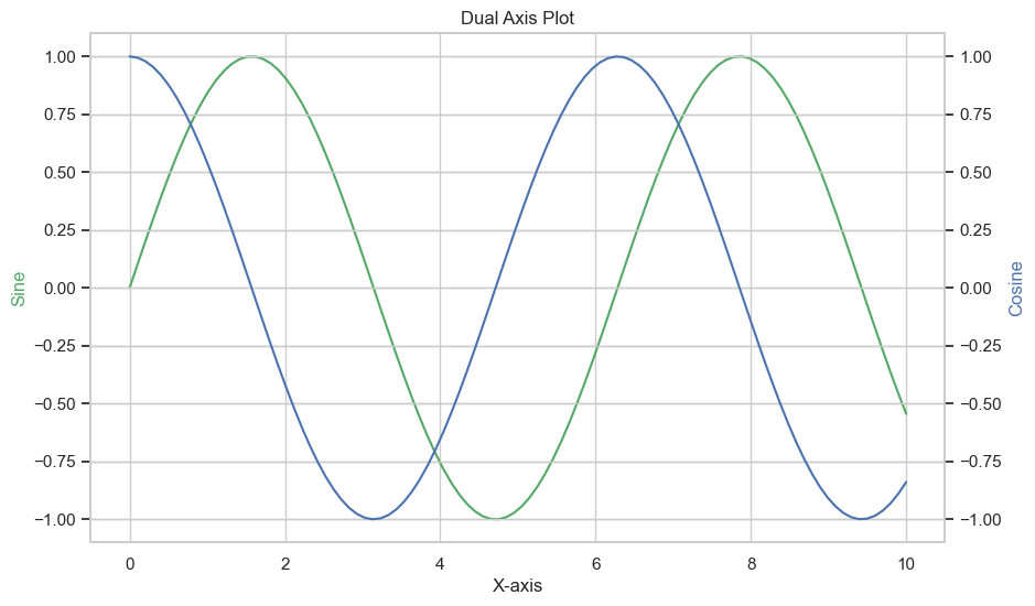
7.双轴图
import matplotlib.pyplot as plt
import seaborn as sns
import numpy as np

# 设置风格

sns.set(style="whitegrid")

# 生成数据

x = np.linspace(0, 10, 100)
y1 = np.sin(x)
y2 = np.cos(x)

# 创建图表

fig, ax1 = plt.subplots(figsize=(10, 6))

ax2 = ax1.twinx()
ax1.plot(x, y1, 'g-')
ax2.plot(x, y2, 'b-')

# 添加装饰

ax1.set_xlabel('X-axis')
ax1.set_ylabel('Sine', color='g')
ax2.set_ylabel('Cosine', color='b')
plt.title('Dual Axis Plot')
plt.show()
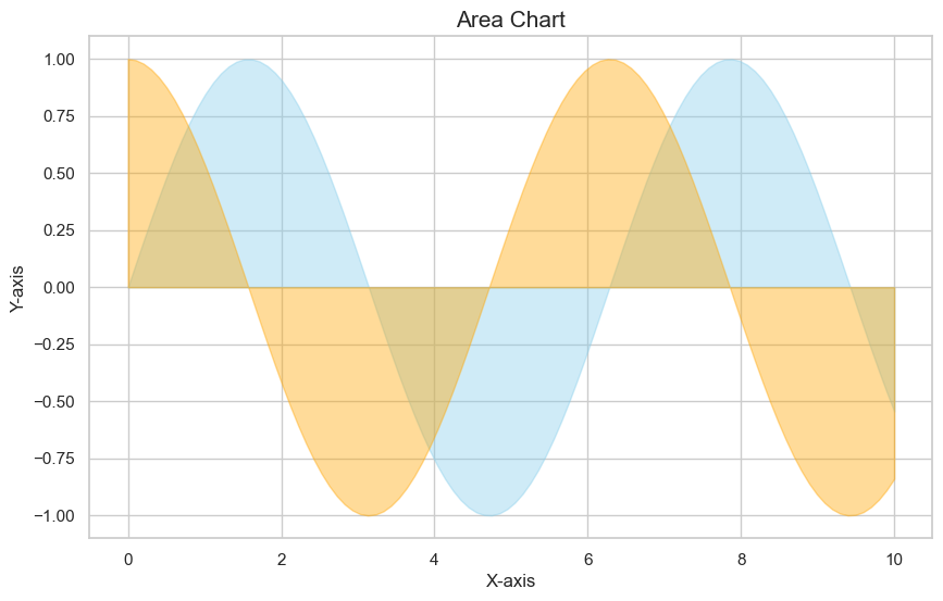
8.面积图
import matplotlib.pyplot as plt
import seaborn as sns
import numpy as np

# 设置风格

sns.set(style="whitegrid")

# 生成数据

x = np.linspace(0, 10, 100)
y1 = np.sin(x)
y2 = np.cos(x)

# 创建图表

plt.figure(figsize=(10, 6))
plt.fill_between(x, y1, color="skyblue", alpha=0.4)
plt.fill_between(x, y2, color="orange", alpha=0.4)

# 添加装饰

plt.title("Area Chart", fontsize=15)
plt.xlabel("X-axis", fontsize=12)
plt.ylabel("Y-axis", fontsize=12)
plt.show()
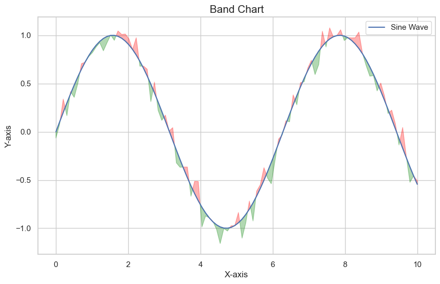
9.带状图
import matplotlib.pyplot as plt
import seaborn as sns
import numpy as np

# 设置风格

sns.set(style="whitegrid")

# 生成数据

x = np.linspace(0, 10, 100)
y = np.sin(x)
z = np.sin(x) + np.random.normal(0, 0.1, 100)

# 创建图表

plt.figure(figsize=(10, 6))
plt.plot(x, y, label='Sine Wave')
plt.fill_between(x, y, z, where=(y >= z), interpolate=True, color='green', alpha=0.3)
plt.fill_between(x, y, z, where=(y < z), interpolate=True, color='red', alpha=0.3)

# 添加装饰

plt.title("Band Chart", fontsize=15)
plt.xlabel("X-axis", fontsize=12)
plt.ylabel("Y-axis", fontsize=12)
plt.legend()
plt.show()
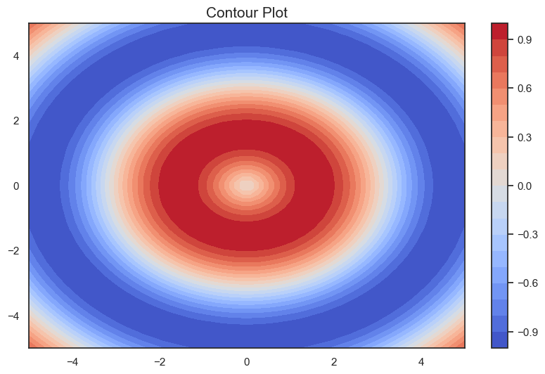
10.等高线图
import numpy as np
import matplotlib.pyplot as plt
import seaborn as sns

# 设置风格

sns.set(style="white")

# 数据准备

x = np.linspace(-5, 5, 50)
y = np.linspace(-5, 5, 50)
X, Y = np.meshgrid(x, y)
Z = np.sin(np.sqrt(X**2 + Y**2))

# 创建等高线图

plt.figure(figsize=(10, 6))
contour = plt.contourf(X, Y, Z, cmap='coolwarm', levels=20)
plt.colorbar(contour)

# 添加装饰

plt.title('Contour Plot', fontsize=15)
plt.show()
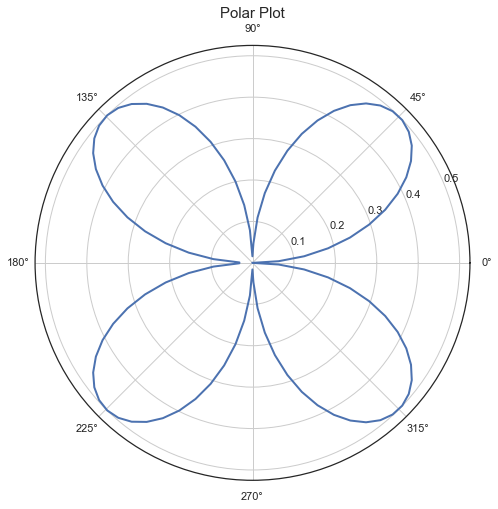
11.极坐标图
import numpy as np
import matplotlib.pyplot as plt
import seaborn as sns

# 设置风格

sns.set(style="white")

# 数据准备

theta = np.linspace(0, 2*np.pi, 100)
r = np.abs(np.sin(theta) * np.cos(theta))

# 创建极坐标图

plt.figure(figsize=(8, 8))
ax = plt.subplot(111, polar=True)
ax.plot(theta, r, color='b', linewidth=2)

# 添加装饰

plt.title('Polar Plot', fontsize=15)
plt.show()
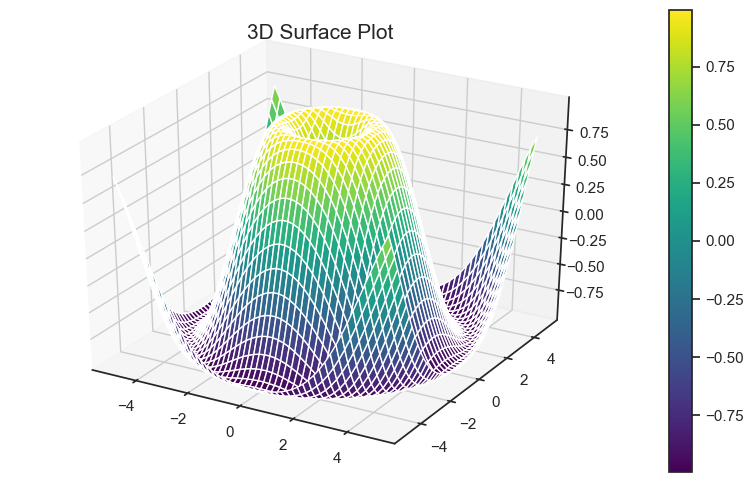
12. 3D曲面图
import numpy as np
import matplotlib.pyplot as plt
from mpl_toolkits.mplot3d import Axes3D
import seaborn as sns

# 设置风格

sns.set(style="white")

# 数据准备

x = np.linspace(-5, 5, 50)
y = np.linspace(-5, 5, 50)
X, Y = np.meshgrid(x, y)
Z = np.sin(np.sqrt(X**2 + Y**2))

# 创建3D曲面图

fig = plt.figure(figsize=(10, 6))
ax = fig.add_subplot(111, projection='3d')
surf = ax.plot_surface(X, Y, Z, cmap='viridis')
fig.colorbar(surf)

# 添加装饰

plt.title('3D Surface Plot', fontsize=15)
plt.show()
13. 3D散点图
import numpy as np
import matplotlib.pyplot as plt
from mpl_toolkits.mplot3d import Axes3D
import seaborn as sns

# 设置风格

sns.set(style="white")

# 数据准备

x = np.random.standard_normal(100)
y = np.random.standard_normal(100)
z = np.random.standard_normal(100)

# 创建3D散点图

fig = plt.figure(figsize=(10, 6))
ax = fig.add_subplot(111, projection='3d')
scatter = ax.scatter(x, y, z, c=z, cmap='viridis')

# 添加装饰

fig.colorbar(scatter)
plt.title('3D Scatter Plot', fontsize=15)
plt.show()

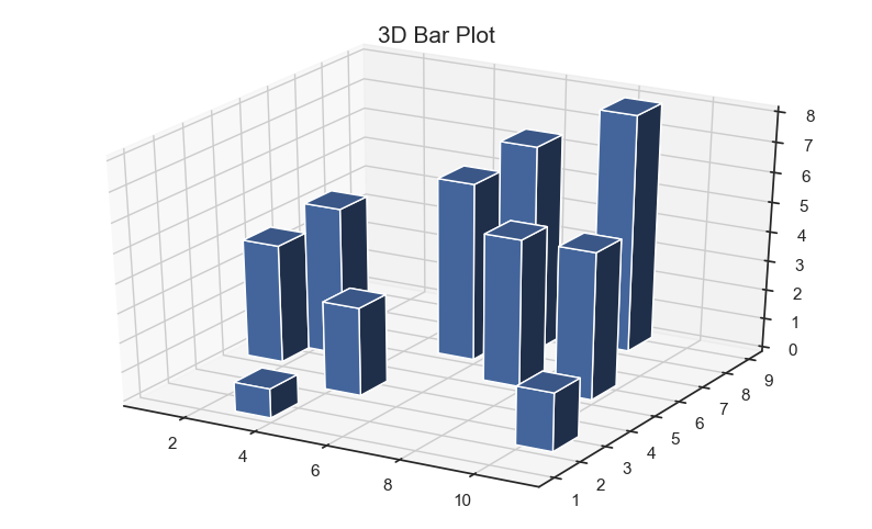
14. 3D条形图
import numpy as np
import matplotlib.pyplot as plt
from mpl_toolkits.mplot3d import Axes3D
import seaborn as sns

# 设置风格

sns.set(style="white")

# 数据准备

x = np.arange(1, 11)
y = np.random.randint(1, 10, 10)
z = np.zeros(10)

# 创建3D条形图

fig = plt.figure(figsize=(10, 6))
ax = fig.add_subplot(111, projection='3d')
bars = ax.bar3d(x, y, z, 1, 1, y, shade=True)

# 添加装饰

plt.title('3D Bar Plot', fontsize=15)
plt.show()
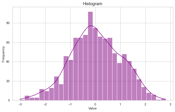
15.直方图
import matplotlib.pyplot as plt
import seaborn as sns
import numpy as np

# 设置风格

sns.set(style="whitegrid")

# 生成数据

data = np.random.randn(1000)

# 创建图表

plt.figure(figsize=(10, 6))
sns.histplot(data, kde=True, color="purple", bins=30)

# 添加装饰

plt.title("Histogram", fontsize=15)
plt.xlabel("Value", fontsize=12)
plt.ylabel("Frequency", fontsize=12)
plt.show()
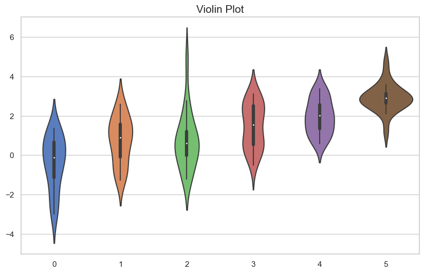
16.小提琴图
import matplotlib.pyplot as plt
import seaborn as sns
import numpy as np

# 设置风格

sns.set(style="whitegrid")

# 生成数据

data = np.random.normal(size=(20, 6)) + np.arange(6) / 2

# 创建图表

plt.figure(figsize=(10, 6))
sns.violinplot(data=data, palette="muted")

# 添加装饰

plt.title("Violin Plot", fontsize=15)
plt.show()
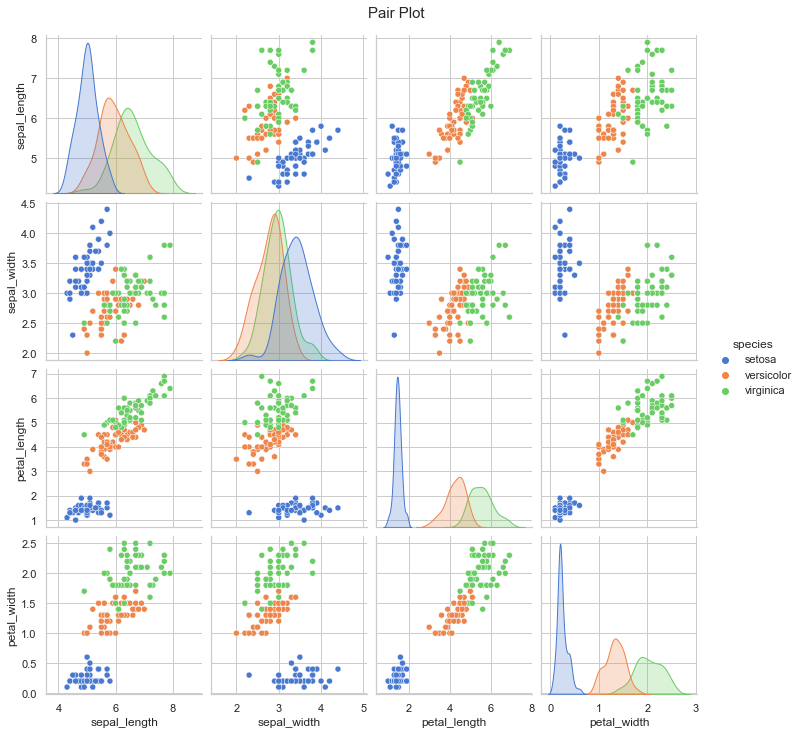
17.成对关系图
import seaborn as sns
import matplotlib.pyplot as plt

# 生成数据

iris = sns.load_dataset("iris")

# 创建图表

sns.pairplot(iris, hue="species", palette="muted")
plt.suptitle("Pair Plot", y=1.02, fontsize=15)
plt.show()
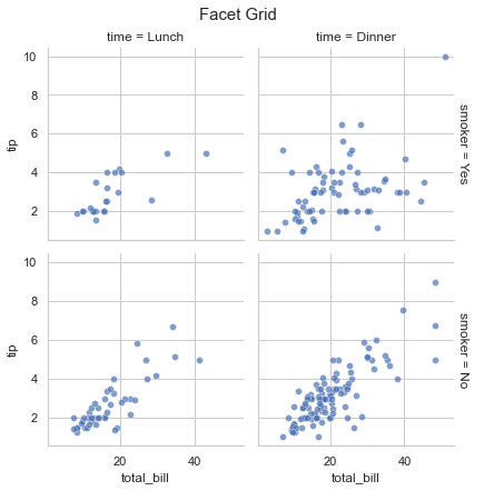
18.Facet Grid 图
import seaborn as sns
import matplotlib.pyplot as plt

# 生成数据

tips = sns.load_dataset("tips")

# 创建图表

g = sns.FacetGrid(tips, col="time", row="smoker", margin_titles=True)
g.map(sns.scatterplot, "total_bill", "tip", alpha=.7)
g.add_legend()

# 添加装饰

plt.suptitle("Facet Grid", y=1.02, fontsize=15)
plt.show()